
Even the simplest spreadsheets—budgets, lists, trackers, and the like—can benefit from the powerful features in Excel that you’d typically avoid because they seem too complicated. They’re actually easier than you think, and they can save you hours.
6
Quick Analysis
Let’s say you have a spreadsheet containing records of your sales. When you highlight some of your cells, the Quick Analysis tool in Excel will immediately offer to do the following for you:
- Sum up your Total Revenue or Units Sold
- Add a chart, which you can use to visualize your Total Profit by Region
- Apply color scales to highlight your most profitable orders
- Turn your data into an Excel Table for easier filtering and sorting

Here’s how it works: When you select any range of cells in Excel, a small icon appears in the bottom-right corner (it looks like a square with three lines and a lightning bolt). Click this icon, or just press Ctrl + Q, and Excel will immediately present a menu with five categories of analysis: Formatting, Charts, Totals, Tables, and Sparklines.
Within each of these categories, you’ll find options tailored to your specific data. When I highlighted fifteen rows with all fourteen columns from my sales records’ spreadsheet, Excel suggested Clustered Column, Stacked Column, Clustered Bar, and Stacked Bar charts under the Charts category.

However, when I narrowed it down to just the Ship Date and Units Sold columns, it changed its recommendations to Line, Scatter, Clustered Column, and Stacked Area charts.

If your selection is small or manageable enough, you can preview each option with a simple hover.

While previewing, if you see something you like, you can click it to create it instantly.
This feature isn’t available on mobile or web versions. To use it, you’ll need Excel 2013 or newer on your desktop.
5
Data Validation
Imagine you’re collecting RSVPs for your wedding. You’ll need your guests to confirm their attendance, choose a meal preference, and maybe indicate if they’re bringing a plus-one. Without Data Validation, you’re bound to receive a chaotic mix of responses: Yes, y, Attending, Chicken, Veggie, 1, one, or even completely blank fields.
Here’s an example of how you can prevent the headache of cleaning such data up:
- Highlight your Meal Choice column and head to the Data tab.
- Look for Data Validation under Data Tools. You’ll recognize it by the icon with two rectangles, one showing a green checkmark and the other a red error mark.
- Click it, choose List under the Allow section, and enter your allowed values separated by commas.
- Hit OK or Apply, whichever applies to your version, and that’s it.

Now, when someone attempts to insert a meal outside your allowed list, they’ll get an error message.

You can also customize that error message. Instead of Excel’s generic error message, you can display something actually helpful, like please enter any of these: Chicken, Fish, or Vegan.

You can set up data validation rules for almost anything. For instance, you could limit a Status column to just Open, In Progress, and Complete, or ensure Date fields only accept dates within the current year. The key is to set this up before you share your spreadsheet with others.
Related
Make Your Excel Spreadsheets Smarter With Dropdown Lists
The simple trick to making your data more reliable and your life easier.
4
PivotTables
I know PivotTables in Excel look intimidating, but they’re actually one of the easiest ways to make sense of massive data sets. Most people avoid them because they think you need to be an advanced user. You don’t.
Suppose you have a 30,000-row sales spreadsheet, and your boss wants to see the Total Profit by Region.

You could spend hours writing formulas and filtering data, or you could create a PivotTable in about 30 seconds:
- Select any cell in your data.
- Head to Insert > PivotTable > From Table/Range.
- Choose New Worksheet and click OK.
- Drag Region to Rows area and Total Profit to the Values area.
Instantly, you’ll see each region and its total profit neatly summarized.

If you want even more layers of analysis, you can drag Country to the Rows area as well, then add Total Cost and Total Revenue to the Values area.
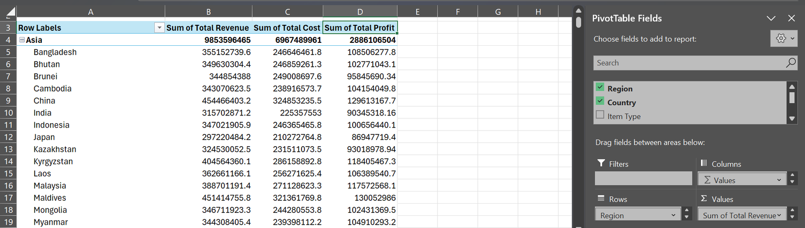
PivotTables don’t just work for sales data. If you’re tracking student performance and want to see which students performed best in each subject, you can also drag the fields around. The same data can answer dozens of different questions without creating multiple spreadsheets or wrestling with complex formulas.
Make sure your data has clear headers and no blank rows for your PivotTable to come out fine.
3
Flash Fill
This feature is basically a way for Excel to read your mind. You show it what you want by typing one or two examples, and Excel figures out the pattern and completes the rest automatically.
If you have a column of full names, like Jessica Doe and Sarah Lee, and you just need the last names in a separate column, you don’t need to type each one out manually. Just type Doe in the cell next to Jessica Doe, press Enter, then start typing Lee in the next cell. Excel will recognize what you’re doing and offer to complete the entire column for you.

The applications are endless: you can split phone numbers into area codes and numbers, combine first and last names from separate columns, extract email domains from full addresses, or even clean up messy text formatting.
The only trick to mastering Flash Fill is giving good examples. If your first two examples don’t provide enough information for Excel to understand the pattern, just add a third example.

Related
My 9 Favorite Excel Formatting Tricks to Make My Data Pop
Because even spreadsheets deserve a little sparkle.
2
Formula Auditing
We’ve all been there: your formula suddenly produces a weird error, and you’re left wondering and checking if you’ve made a typo somewhere in row 247. Thankfully, Excel’s Formula Auditing tools can show you exactly what’s wrong in seconds.
Let’s say you’re calculating profit margins across hundreds of rows. You’d likely have a Total Margin column (dividing Total Profit by Total Revenue) and an Adjusted Margin column (multiplying Total Margin by 0.9).

Everything looks perfect until you scroll down and see error messages scattered throughout your data. That’s where Formula Auditing comes in.
Highlight any cell showing an error and head to the Formulas tab. Click Trace Precedents, and Excel will draw arrows pointing to the exact cells feeding into your broken formula. In my experience, you’ll usually spot the problem immediately—maybe the total revenue is zero, you’re referencing an empty cell, or the cell contains text instead of a number.
Trace Dependents works in reverse and might be even more useful. You can highlight any cell to check which other formulas rely on it. This is incredibly helpful when you’re about to delete or modify a cell and want to know what else might break.
The real game-changer is the Error Checking tool. This tool automatically flags issues like division by zero, references to empty cells, or formulas that don’t match the pattern in their column.

These tools transform Excel formulas debugging from frustrating guesswork into a seamless process.
This feature isn’t available on mobile or web versions.
1
Conditional Formatting
Numbers on a spreadsheet are just numbers until you give them context. Take a budget spreadsheet, for instance. You’d have to look at it for a while before you can understand what you really did with your money all month long.
Instead of manually comparing your actual spending to your budget across twenty different categories, you can use Conditional Formatting to make your spreadsheet so colorful that you can instantly tell where you overspent and where you saved money. In my monthly budget, I have a Variance column that shows the difference between what I budgeted and what I actually spent. Then, I let Conditional Formatting do the heavy lifting.

First, I select all the cells in my Variance column and click Conditional Formatting on the Home tab before doing this:
- For Overspending: Click Highlight Cells Rules > Greater Than, type 0 in the box, and choose a highlight color (maybe Light Red Fill with Dark Red Text)
- For Underspending: Go back to Conditional Formatting > Highlight Cells Rules > Less Than, type 0 again, and pick a different color
- For Exact Spend: Use Conditional Formatting > Highlight Cells Rules > Equal To, type 0 one more time, and select yet another color
Immediately, my positive numbers (overspent) glow green, negative numbers (saved money) turn red, and exact matches stay yellow. I know my color choices are weird, but it works for me. One glance tells me everything I need to know about my month.

Data Bars are also incredibly useful for seeing your spending patterns at a glance. You can apply them to your Actual Spend column, and each cell becomes a mini bar chart. You’ll immediately see that you spend way more on groceries than utilities without having to compare numbers.

Icon Sets are also great for tracking trends. Add them to your Change from Last Month column, and you’ll see up arrows where spending increased significantly, sideways arrows where it increased mildly, and down arrows where it reduced.
The biggest mistake newbies to Excel’s Conditional Formatting make is going overboard. Your goal is to make important information jump out, not to turn your spreadsheet into a Christmas tree. So, highlight only what needs attention.

Related
Why I Stopped Using Google Sheets and Came Back to Excel
Google Sheets isn’t a match for Excel.
Mastering even a couple of these features can transform the way you work in Excel. They’re not just power tools. They’re time-savers that’ll make you work like a pro.

:max_bytes(150000):strip_icc()/jbl-go-3-2139a2f30edf41a683362243277e0cef.jpg?w=1174&resize=1174,862&ssl=1 "Best Prime Day Speaker Deals Under")
Leave a Comment
Your email address will not be published. Required fields are marked *