So you’ve got all your data lined up, but when you chart it in Excel, it looks like something a high school student made. Luckily, a few subtle tweaks can turn your Excel charts from sad to slick.
1
Start With the Right Chart
No Design Hack Saves the Wrong Chart Type
This isn’t a design tip, but it’s fundamental to what we’re trying to achieve. Using the wrong chart type guarantees failure from the start. You can’t salvage a line chart that should’ve been a stacked bar. No amount of design wizardry can fix a mismatched visual representation.
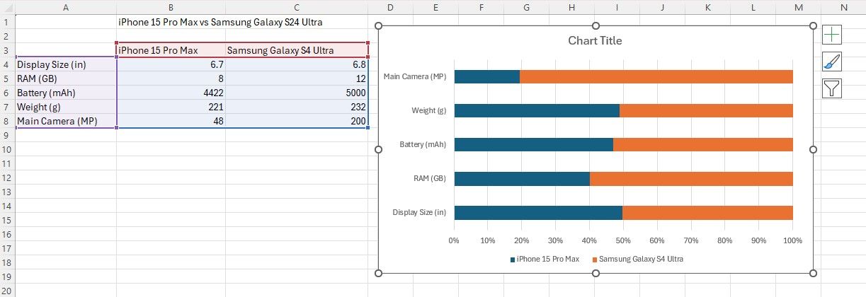
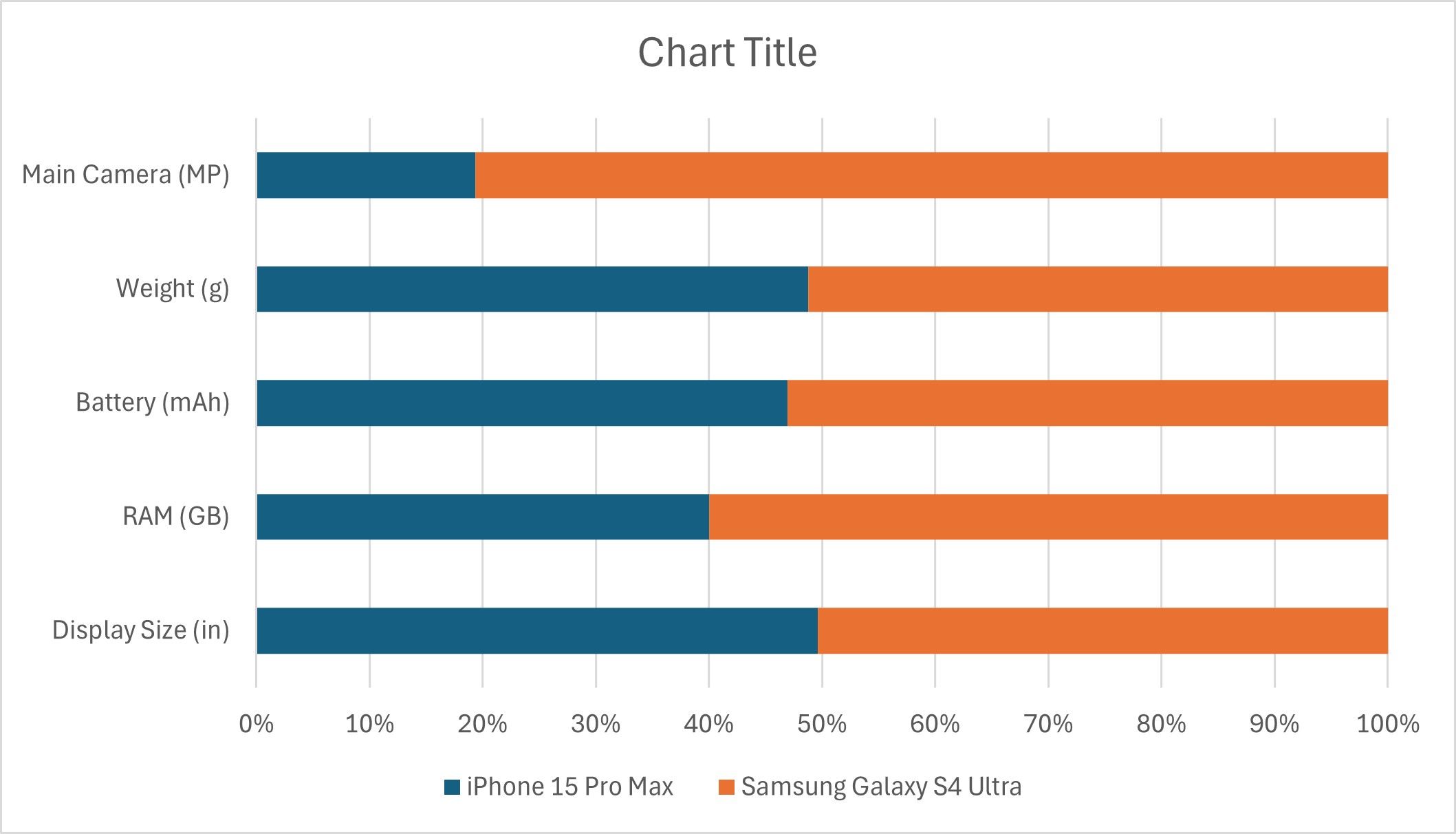
Learn your Excel chart types. Know what works best for comparisons, distributions, parts of a whole, and trends over time. In this case, I’m going to compare the iPhone 15 Pro Max and the Samsung Galaxy S25 Ultra with a stacked bar chart.
2
Pick a Purposeful Palette
You Can Do Better Than the Default
Excel dutifully assigns contrasting hues, but it cares about distinguishability, not aesthetics. Decide on a micro-palette: one brand color for the hero series, one neutral for the baseline, maybe a second accent if you have multiple comparisons.
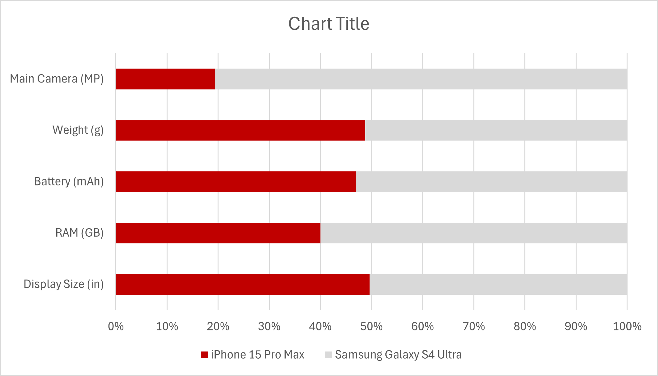
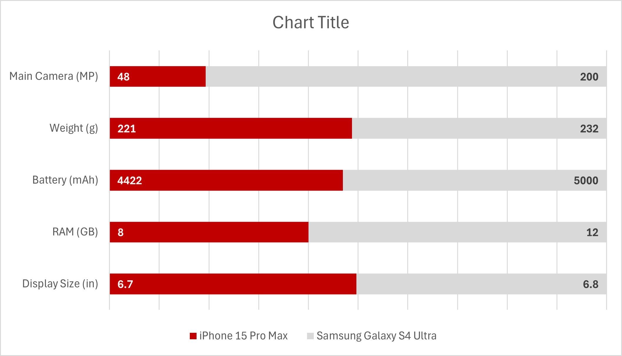
In the example below, I use MUO Red for Apple and a soft graphite for Samsung. Right-click the data series and change the fill color to apply yours. Just doing this makes a huge difference in readability and aesthetics.
3
Add Data Labels (or Callouts)
Don’t Make People Guess
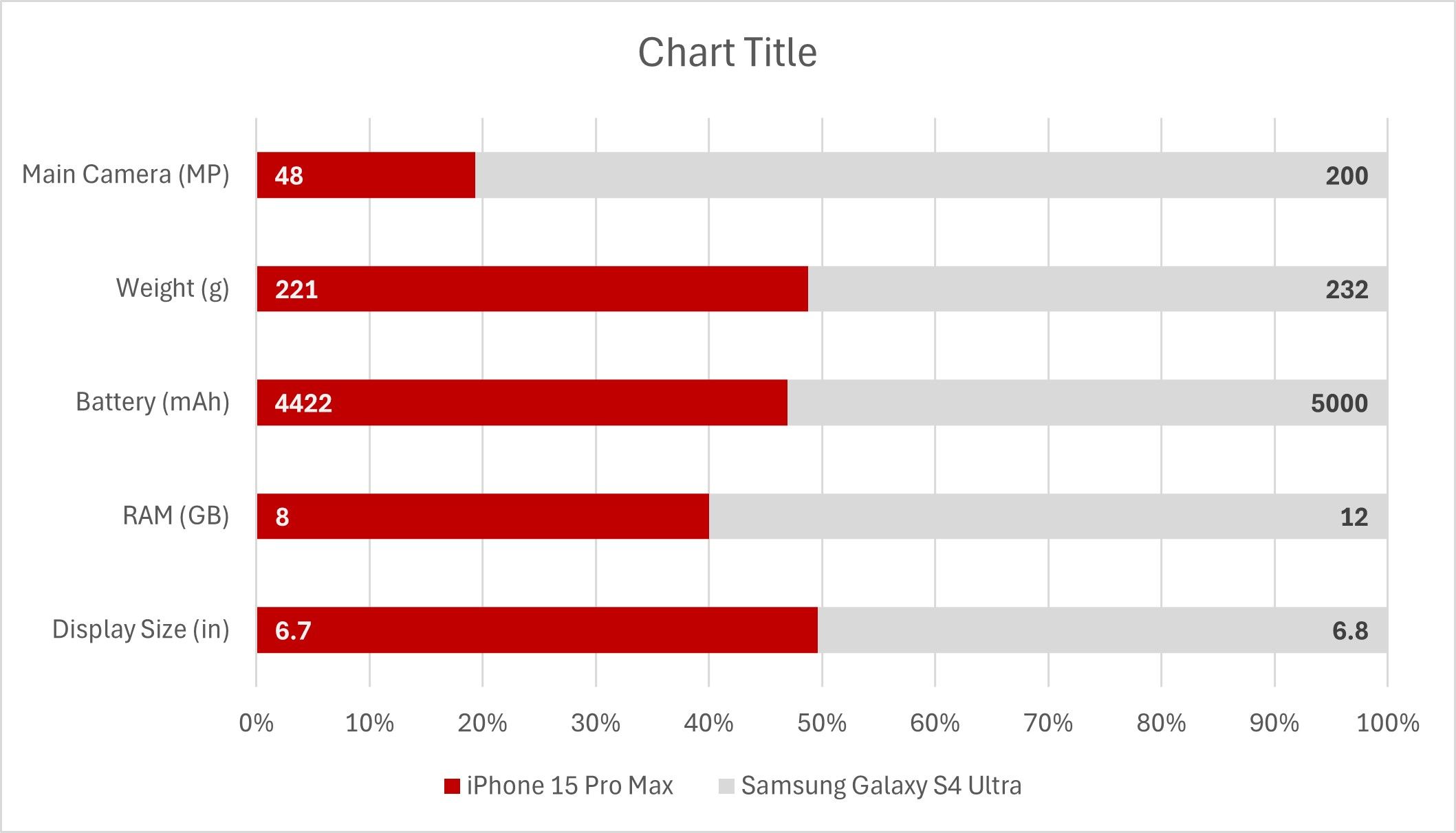
Nothing slows comprehension like forcing readers to jump from bar to axis to bar to decode a single value. Data labels eliminate that detour. Right-click the series and select Add Data Labels. But don’t stop there—positioning matters.
For a two-series bar chart, align labels functionally: left-side data gets Inside Base and right-side gets Inside End. This keeps labels out of each other’s way and makes the visual flow logical. You can style the labels too. If the fill is dark, make the text white and bold so the numbers pop.
4
Lose Redundant Axes
Less is More
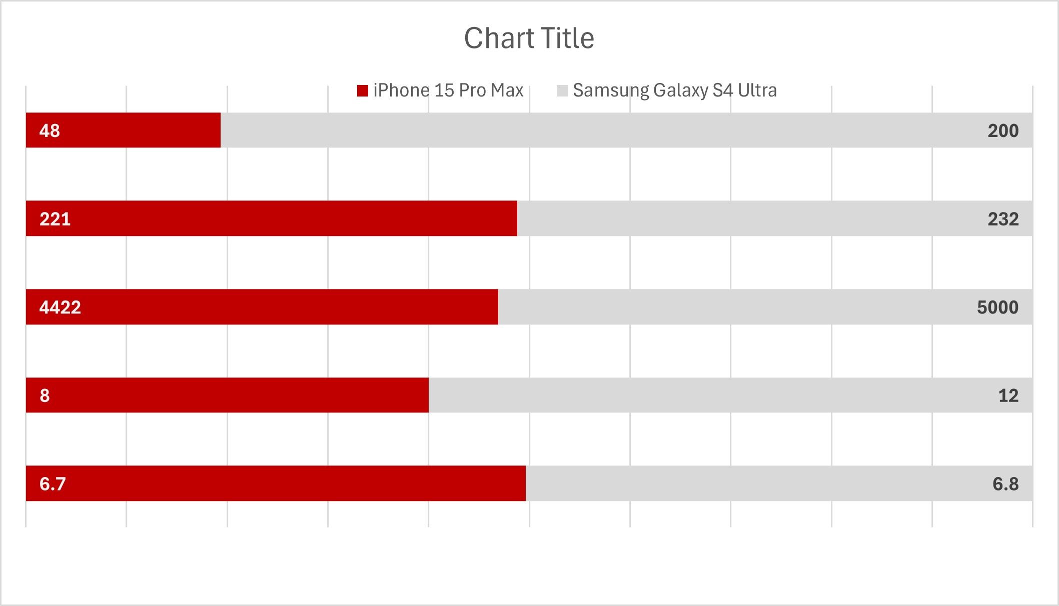
If you’re showing relative values or percentages and you’ve added labels, you probably don’t need the horizontal axis. Why clutter the chart with numbers people won’t read? Click the axis and hit Delete. Clean visuals win.

Related
How to Show or Hide Chart Axes in Excel
Tired of cluttered charts? Learn how to show or hide chart axes in Excel to make your data look clean and professional.
5
Use Manual Labels for Categories
Save Space With Text Boxes
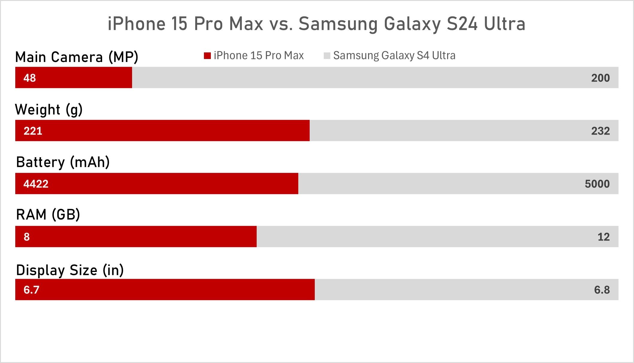
Vertical axis labels take up space and don’t always add value. Instead, use text boxes as custom labels placed directly above each bar. To get started, delete the vertical axis.
Then, go to Insert > Text Box and draw one over a bar. But don’t type the category right into it. Using static data is a rookie Excel mistake. Instead, click the text box, type = in the formula bar, and select the relevant cell from your data table to bind it.
From here, duplicate the text box by holding Ctrl and dragging it over the remaining bars. Click each text box and update its content accordingly. Repeat the trick for the chart title so every visible word links to real data.
6
Kill the Chart Junk
Clean Charts Are Clear Charts
Charts are meant to be informative, but too much information defeats the purpose. Look at your chart, identify its main components, and delete the rest. In this case, gridlines are extra; since the bars have data labels, you don’t need them. Hit the little + beside the chart, uncheck Gridlines, and the visual noise will instantly decrease.

Related
How to Graph Trigonometric Equations With Excel
Want to graph trigonometric equations, but don’t know where to start? Here’s how to do it in Excel like a pro.
7
Switch the Font
Aptos Doesn’t Cut It
Excel’s default font, Aptos, is overused and unremarkable. Pick something cleaner and more modern—Bahnschrift is a great option and is already installed. Select the chart elements (title, labels, axis text, etc.), then change the font. It’s a small change but it massively upgrades the chart’s personality.
8
Add a Subtle Background
Make Your Chart Pop
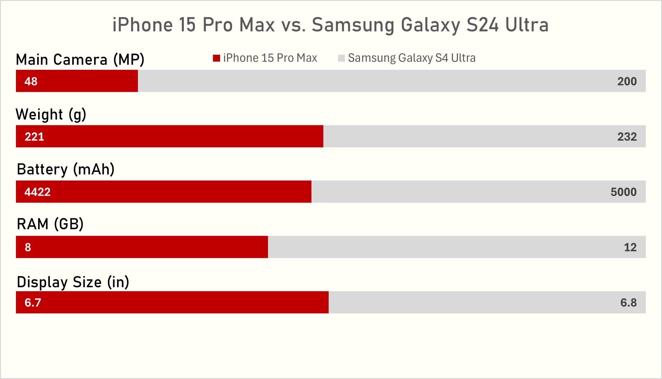
Optional, but effective. A subtle background helps separate your chart from the rest of the worksheet or slide. Select the chart and go to Format Chart Area > Fill > Solid Fill. Choose a very light gray (for a light theme) or very dark gray (for a dark mode feel). Avoid full white or pure black—they’re too harsh. Go for something that provides contrast without stealing the show.
Below you’ll see the raw Excel default beside the chart after these tweaks. You’ll notice that one of them looks significantly better than the other.
9
Never, Ever Use 3-D
Fake Depth Kills Real Data
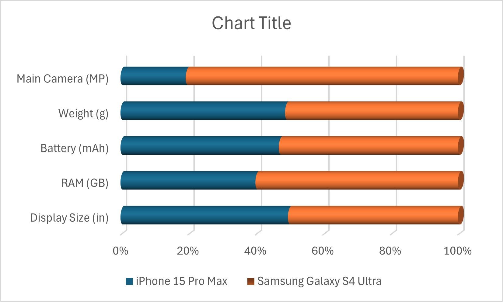
There’s no nice way to say this: 3-D charts in Excel are a design disaster. They distort your data, add fake depth, and shift focus away from the actual values. They’re a relic from the early 2000s—back when bevels, gradients, and drop shadows were considered cutting-edge.
The problem with 3-D charts isn’t just that they look outdated. It’s that they fundamentally misrepresent the data. Bars in 3-D appear wider or taller than they really are which makes comparing values harder. Stick to flat, 2D visuals. They’re cleaner, easier to interpret, and more honest.
Excel’s defaults exist to be overridden. Embrace that fact, follow the tips above, and your next chart will look intentional, not incidental.






Leave a Comment
Your email address will not be published. Required fields are marked *