It’s been almost four years since Windows 11 came out, and it still feels like it’s in beta. Now that Microsoft has thoroughly botched the release of Windows 11, I miss some old features of Windows 7 and XP more than ever. I bet you’ll relate to at least one.
Aero Glass
I prefer the design language of macOS to Windows in pretty much every iteration, except one. The Aero Glass design language, which Windows Vista introduced, and Windows 7 perfected, was peak of the Windows aesthetic.
Following the bright and plasticky “Luna” theme of Windows XP, the Aero Glass felt modern and fresh. It completely rebuilt the look and feel of Windows with a clean and airy interface.
The Frutiger Aero era welcome screen and the fuzzy points of light that converged into the Windows logo with that serene startup sound. Thinking back, almost every sound effect and chime in Windows 7 had that soothing quality.
The first thing you noticed after a fresh install (other than the iconic wallpaper) was the see-through taskbar. Every window and dialog box had that same transparent look, even when you dragged them around. The title bar and its buttons were glassy too (unless hovered over, which made them glow). Stacking multiple windows made them blurry, giving the illusion of frosted glass. You can cycle through open windows with the “Flip 3D” shortcut that stacks them all in 3D space.
Almost every element responded with a subtle animation. The Start menu button would light up with a satisfying glow when hovered over. Icons would feel as if you’re “pressing down” on them whenever hovered over. Active tabs have live previews of the active window in the thumbnail.
Then there were smaller touches like the sleek and glossy progress bar, which smoothly progressed unlike the blocky progress bar in Windows XP. The taskbar icons also flashed in soft green when a task was in progress, as did the live thumbnail previews. The in-built themes made the UI even more impressive with transitioning wallpaper slideshows.
No Windows aesthetic beats the clean and crisp look of the Aero Glass design language. I will forever remain nostalgic for those elegant animations and the clarity of the UI. If they ever redesign Windows, I hope they bring back Aero Glass. It was definitely peak design and never failed to impress me.
Before Windows 11 broke the Start menu, we used it all the time. The Start menu on Windows 7 features two columns, a search bar, pinned items, a jump list (with recent items) and an all programs menu, so you can easily locate that app you just installed or launched. It was functional, and you could use it with muscle memory alone.
Windows 7 was the last version where the Start menu made sense. After that, Microsoft started stripping away useful Start menu features and changing layouts in every iteration.
The Metro UI of Windows 8 took away the menu button entirely and replaced it with a grid of “Live Tiles” activated with a cursor gesture. Everybody hated it, so they brought back the classic layout in Windows 10 but kept the live tiles from Windows 8, which created a mismatched, awkward mess.
Windows 10 still had a somewhat usable Start menu, but Microsoft made sure that Windows 11 didn’t. It moved the Start button to the center and with it, the entire menu. The whole menu was stripped completely except for a couple of default pinned shortcuts. You can’t drag and drop things into it. It doesn’t have recent items, explorer shortcuts, or different system menus.
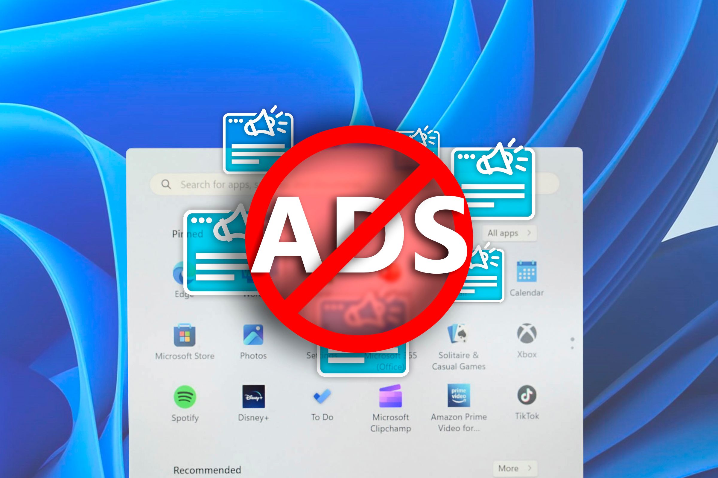
The search bar shows random garbage from Bing and ads for games and apps. There are even ads in the main Start menu. Occasionally, you will see shortcuts for random, but when you click them, it starts installing the apps from the Microsoft Store. You can have more or fewer of these ads, but Windows 11 doesn’t let you turn them off (currently, there’s no button to disable ads in the settings app.)
In place of the original Start menu, Windows 11 has a “Feed” widget that shows you news stories, stock prices, and weather updates from MSN.
A Taskbar That Made Sense
Microsoft recreated the taskbar for Windows 11 and left out a bunch of core features. You can’t personalize the taskbar in any meaningful way anymore. You could reposition the bar anywhere on the desktop edges, left, right, top, or bottom until Windows 10, but you can’t in Windows 11. You can’t resize the taskbar either.
When asked why you can’t move or resize the taskbar anymore, Microsoft developers explained that not enough people wanted the personalization, so they didn’t code it. However, that makes no sense to me. Windows has some 1.5 billion users worldwide and Microsoft plans on forcing them all to switch to Windows 11. So even if a small percentage of people want it, that’s still millions of users, roughly speaking.
On top of that, the toolbar feature has also been removed, and you have to right-click on the Start menu to open the power user menu, as opposed to anywhere on the taskbar.
Local Accounts That Respected Your Privacy
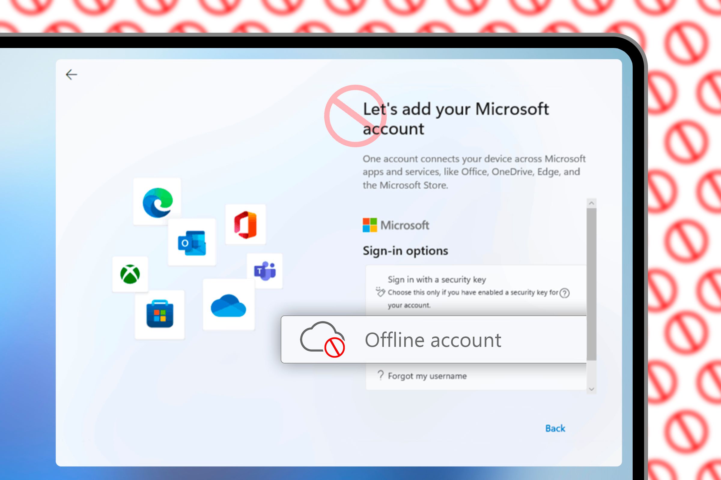
Logging in to Windows used to be simple. You created a local profile and set a password to unlock your machine. However, in a new attempt to mine as much user data as possible, Microsoft has made it (almost) impossible to create local accounts on Windows.
For some versions of Windows 11, Microsoft simply doesn’t let you continue the installation if you don’t log in with an online account. You have to disconnect Wi-Fi or pull up the console to bypass that restriction.
Other versions make it harder to start a local account by purposefully obscuring the button. The button could be labeled “offline account” or “continue with a limited setup.”
Microsoft recently took down some pages on its support website that contained instructions for creating local accounts. It eventually restored them after facing backlash from customers.
No Bloat
Our machines are so much more powerful now, so Windows should be snappier than ever. But somehow older computers with Windows 7 felt faster and more responsive, especially under heavier workloads. What gives? As it turns out, they weren’t hamstrung with bloatware.
Microsoft has stuffed ads and bloatware everywhere it can in the Windows 11 UI. We had just gotten a break from Cortana and Microsoft concocted Copilot. Now Copilot starts up by default on my computer, even after I disabled it using the Task Manager. It’s prepackaged with Windows and I tried uninstalling it, but it keeps showing up again.
Bing and MSN are polluting the search and Start menus. The Start menu also pushes Microsoft’s “recommended” apps. File Explorer is now “cloud-powered,” which pushes OneDrive. Xbox Game Bar and Teams are preloaded sometimes. Often, you’ll see TikTok, Candy Crush, and Spotify in the Start menu after a fresh installation.
Before the launch of Windows 11, Microsoft promised that it would declutter the context menu. Sure enough, they decluttered it by turning all the core buttons into icons and putting them on top of the context menu. They hid the rest of the buttons under a “Show More Options” menu.
If it was any random context menu, I wouldn’t miss the original version. But the File Explorer context menu is my most used menu shortcut. I heavily rely on it to move files around, rename them, pin them, open them, and archive them. I know the Explorer shortcuts for these actions, but (for some reason) I never got used to them.
For years, I could use this menu on muscle memory alone. With Windows 11, I have to stop and look for the right button every single time. I wish Microsoft would let everyone customize their context menu, because that’ll be the easiest way to declutter it.
Right now, the only way to get the original menu back is by going into the registry and switching a key. It’s not seamless though, because Windows Update constantly breaks that patch.
Old School Photo Viewer
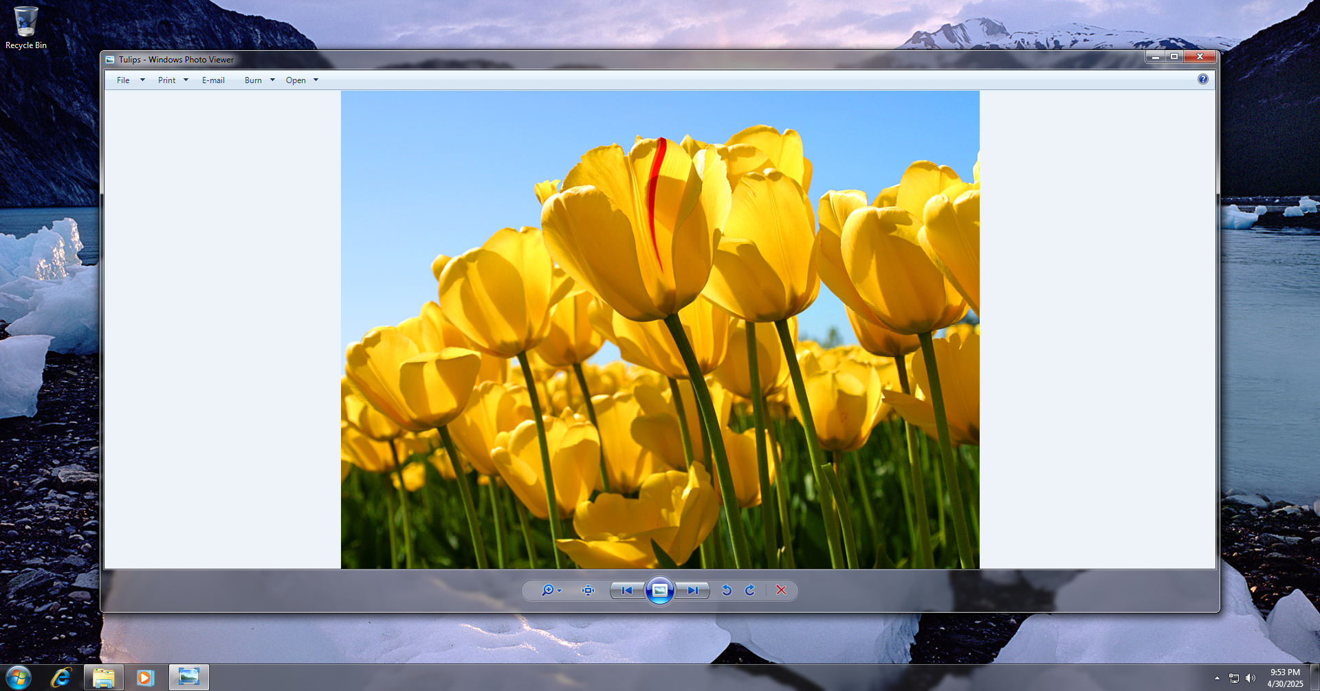
In my humble opinion, the old-school Windows Photo Viewer will forever be better than the Photos app. It has clear buttons in the center for navigating images, zooming, rotating, and deleting. It was simple and worked instantly without any lag whatsoever.
Microsoft Photos offers an inferior user interface and experience. Plus, it lags. I’ve sat through pinwheels loading images, even on modern Windows machines. I’m sure you have too (the lag is even more pronounced on slightly older hardware). That should never happen for an action as simple as viewing a regular image file.
The Photos app is bogged down with AI and cloud integrations. Even before they added these features, the app felt slower than Windows Photo Viewer.
It’s not just the bloat though, because Photos has a bad user interface. I can never reliably use it. Say, you have a folder with a bunch of images in it. If you double-click one of them, it opens in Photos. So far so good. Then you try flipping through the rest of the images, but you can’t because (for some bizarre reason), Photos doesn’t let you scroll through images directly from File Explorer. You have to click an image within the Photos gallery to cycle through your collection.
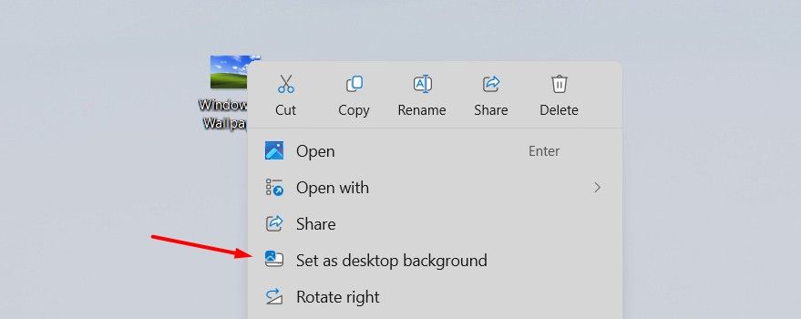
Often, it just refuses to let me set an image as the wallpaper or lock screen, no matter how many times I try. The navigation buttons which were once neatly organized in the Photo Viewer are now scattered across the interface or replaced with a filmstrip and a bunch of icons.
Built-in Games
If you’ve only ever used Windows 10 and onwards, you may not know this, but Windows used to come with some really fun games. Windows XP had 3D Pinball: Space Cadet, which I used to play with my cousins. For a bunch of kids who didn’t have internet access, it was a great way to pass lazy summer afternoons.
Windows 7 had Chess Titans, Minesweeper, Freecell Solitaire, and a few others. My dad taught me Solitaire, Chess, and Minesweeper. I still remember the animation that came up when he won a game.
Chess Titans was one of the first 3D games I played. I’m just as bad at chess today as I was back then, but I distinctly remember feeling impressed by the realistic look and feel of the game.
Picking Your Default Apps Without the OS Fighting Back
There was a time when you could pick the default apps on Windows with just one click. On newer versions of Windows, you have to tediously configure every file and link type to open with the app of your choice.
For example, if you want to set a default media player, you have to scroll through ten different file types and manually change the defaults for every single one.
Windows 10 briefly restored the original default menu, with the added option of refining defaults by file type and link type. That was the perfect solution. Microsoft’s support pages say that Windows 11 offers the same solution with multiple default type options, but my copy of Windows 11 doesn’t have them.
Not all is lost though, because you can get many of these features back on Windows 11. You can restore the old context menu, make local accounts, get Windows Photo Viewer back, and remove some bloatware.




Leave a Comment
Your email address will not be published. Required fields are marked *