A giant grid of numbers can be mind-numbing. Once I discovered the magic of color-coded rules, spotting shifts and irregularities got a whole lot easier. A vivid spreadsheet quickly calls attention where it’s needed most.
4
Turn Numbers Into Data Bars
When looking at numbers, a visual comparison can help our brains quickly identify patterns and relationships. Whether it’s numbers, percentages, or currency, adding horizontal bars through conditional formatting in Excel can help you extract insights at a glance.
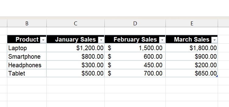
The example will use a simple report that shows the sales of products over a three-month period (January, February, and March).
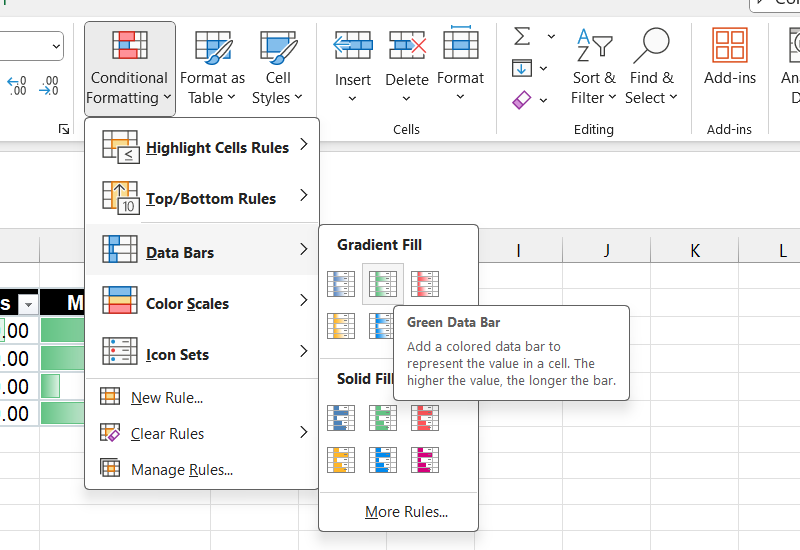
To apply horizontal bars to the numerical data, select the Home tab, click Conditional Formatting > Data Bars, and select one of the options in the Gradient Fill or Solid Fill sections.
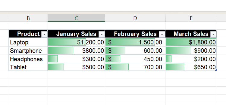
Once the bars are applied, you can instantly see which product is the top performer without looking at the figures. As you can see, laptops were the top-selling products in all the months, while headphones were the lowest.

Related
How to Make a Bar Graph in Excel
Learn how to create bar graphs and demonstrate your data using stripes in Excel.
3
Visualize Trends with Icons
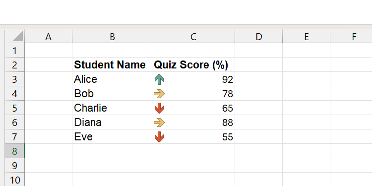
The biggest advantage of icons is their intuitiveness, which allows you to categorize data more clearly. For instance, putting a green up arrow next to a number can instantly indicate an upward trend without even looking at the number.
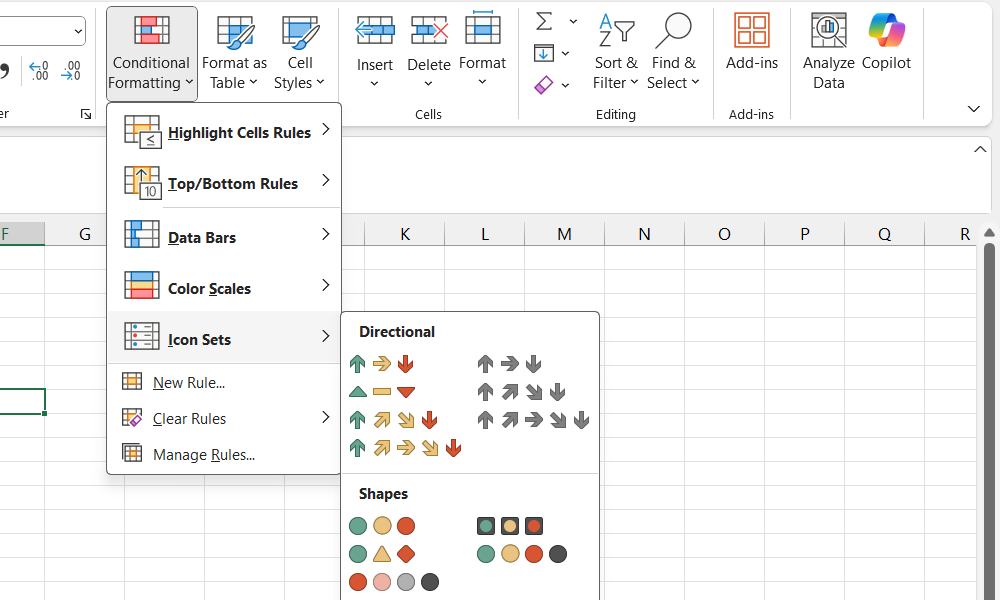
To add an icon, click Conditional Formatting > Icon sets and choose one of the options there.
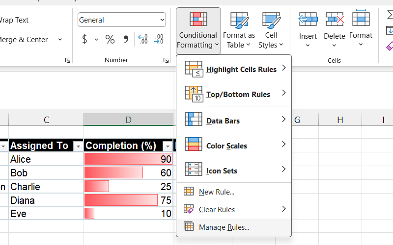
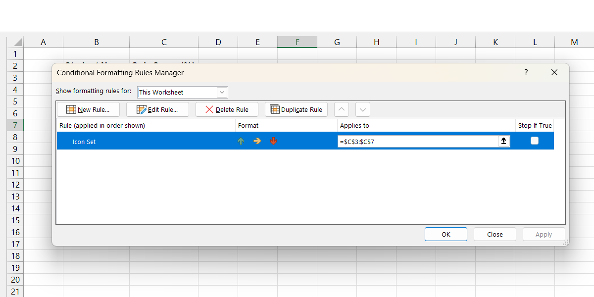
Next, you will need to define what trending up or down means. Click Conditional Formatting > Manage Rules.
Select the icon set you just created and click the Edit button.
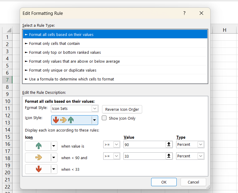
Here, you can set how to display the icons based on the value of the cell. For example, When value is to 90 and the operator to >= means that when the value is greater than or equal to 90, a green arrow will appear next to the cell.
Afterward, click OK and then click OK again to apply the changes.
Besides trends, you can use the icon sets to indicate other things. For instance, stars can indicate top performers or a stop sign can indicate problematic data.
2
Highlight Entire Rows Based on a Cell Value
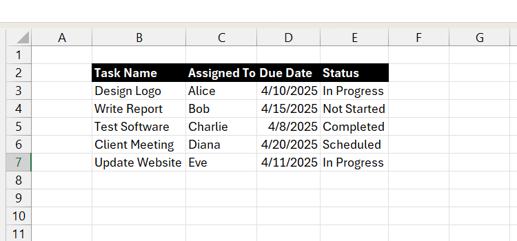
Highlighting a row in an Excel sheet is a great way to indicate what you want someone to immediately focus their attention on. In our example, we are going to look at a report with data about the statuses of tasks. Excel will highlight the ones that are overdue in red based on the Due Date (column D).
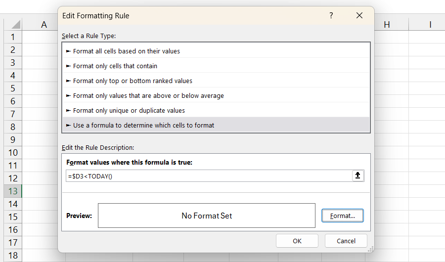
To do that, click Conditional Formatting > New Rule. Select Use formula to determine which cells to format, and under Format value where this formula is true, enter the following formula:
=$D3
In the formula above, $D3 tells Excel the column where the cells to check are located. TODAY() is a DATE function in Excel that returns the current date. The whole formula says that if a date in the Due Date column is less than today, we want to do some conditional formatting.
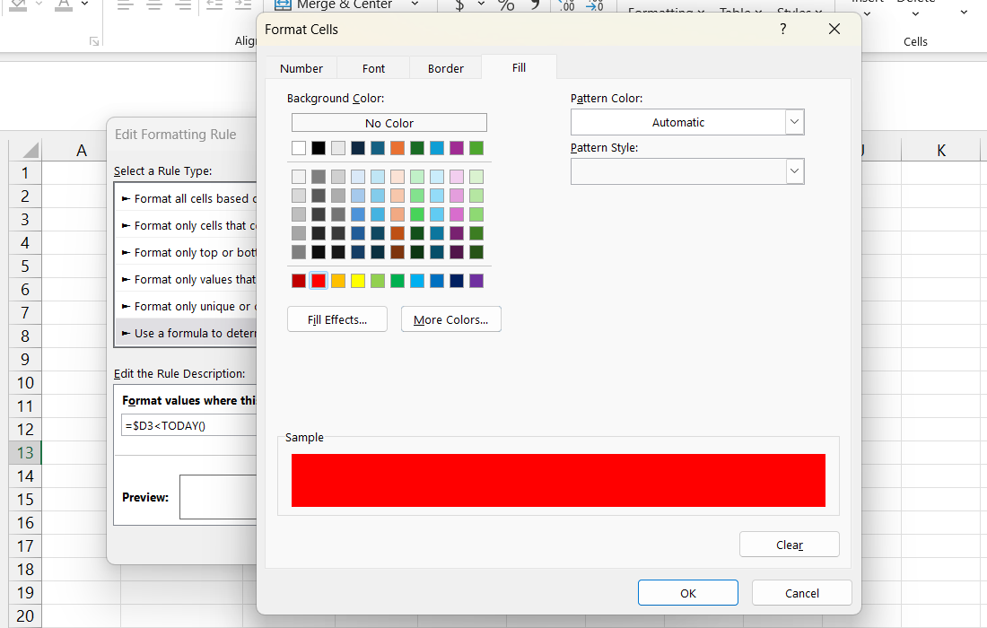
To set the fill color, click the Format button in the Edit Formatting Rule window. Then, select the Fill tab and pick red from the list of colors. Next, click OK.
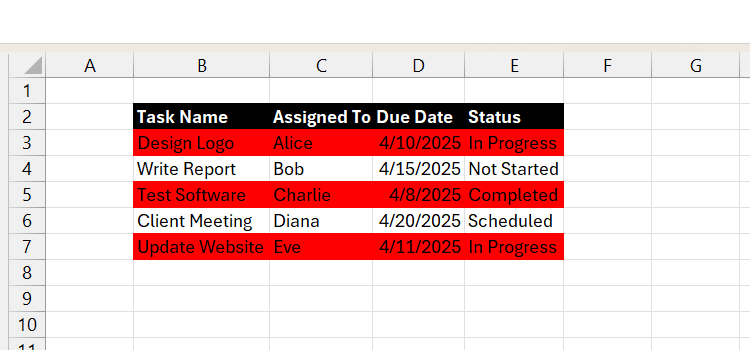
Afterward, click OK and then click OK again to apply the changes. You will see that for every row where the date is earlier than today (4/12/2025 at the time of writing), the row will be highlighted.
1
Dynamically Alternate Row Colors (Zebra Shading)
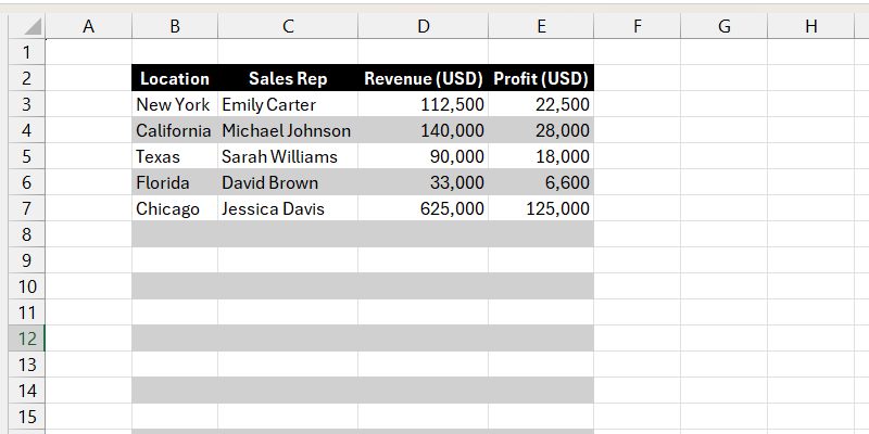
A zebra has alternating black and white stripes, which is where the concept of zebra shading comes from. It is a great way to visually break up rows so people can easily keep track of which row they’re viewing. By using conditional formatting, you can dynamically add zebra shading to your report that automatically updates as you add or delete rows.
To do that, select all the rows you want to add the zebra shading to, which can include future ones, and click Conditional Formatting > New Rule. Select Use formula to determine which cells to format, and under Format value where this formula is true, enter the following formula:
=MOD(ROW(),2)=0
The above formula will make it so that the even rows have conditional formatting while the odd ones will remain white.
Now, click Format and select a light gray from the list of colors in the Fill tab. Afterward, you will see that zebra shading has been applied to the selected cells. And when you delete or add a row within that range, the formatting is maintained.

Related
My 9 Favorite Excel Formatting Tricks to Make My Data Pop
Because even spreadsheets deserve a little sparkle.
With these simple conditional formatting tricks, people will find your Excel reports not only easy to read but engaging as well. Try implementing these techniques in your next report and see if they will make a difference.




Leave a Comment
Your email address will not be published. Required fields are marked *